Unless you have had your head in the sand, you will have heard the term “Responsive Web Design” or RWD.
So what is Responsive Web Design?
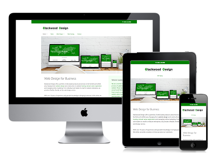
Well, in a nutshell it is a type of website design that enables a website to respond to the type of device it is being viewed on and then display the site in a way best suited to the type and size of the screen. So whether you are looking at the site on a desktop PC, a tablet computer or a mobile phone, the site adapts and displays accordingly. This is often referred to as “Mobile Friendly”.
So why do you need a website that is responsive?
There are two main reasons. Firstly having a website that is mobile friendly will enable a greater audience to view your site. With the explosion of mobile browsing in the last few years, resulting in well over 50% of internet traffic coming from mobile devices, it pays to cater for people viewing your website from a mobile device.
Secondly Search engines (particularly Google) are placing more importance on mobile friendly sites within their search results. So if your site is not mobile friendly, Google will give preference to another site that is.
You can test if Google see’s your website as mobile friendly by going to the Google Mobile Test page at https://www.google.co.uk/webmasters/tools/mobile-friendly/ and entering your website address.
Contact us to have a chat about how we can help you with your responsive website design.